Overview
President's Cup is a digital game designed for CISA's annual cybersecurity competition, where 240 five-person teams compete to save mankind by piloting their spaceship through the galaxy while solving real cybersecurity challenges using virtual machines. The game is a narrative container for the competition's technical challenges, giving teams a shared world, a ship to crew, and a mission to complete together.
Role: Game Designer, UX Design Intern
Duration: April 2022 - August 2022
Tools: Figma
Team: Morgan C. Evans, Brendan Valley, Audrey Renouf, Rowan Dunlop, Hagan Miller
Client: Carnegie Mellon University, CISA
Design Challenge
The core design challenge of this project was designing a coherent, immersive experience around content we could not see or control. The cybersecurity challenges were black boxes. We knew they existed and roughly where they fit in the flow, but we had no visibility into what players would actually be doing inside them. Our job was to design the connective tissue that made the whole experience feel meaningful and fun, regardless of what was inside each box.
Learning the Lore
Before I could design anything, I had to understand the world. President's Cup had been running for years, and an entire narrative universe had been developing, with factions, politics, and story arcs that returning players would already know. I spent about two weeks immersing myself in the existing narrative, iterating constantly with team members who had been part of the project in previous years.
The world I inherited was rich: a galaxy populated by Aurellians divided into three factions, the elite, the warrior camp, and the merchant camp, each with their own motivations and histories. The 2022 narrative followed players as crew members of the Dauntless, a ship navigating the galaxy to collect an alien codex across six mission locations while contending with the Harmony hive mind threat. I needed to learn enough to be able to situate the rest of the designers and developers in the world so we could all make decisions that honored years of existing lore.
Mapping the Loop
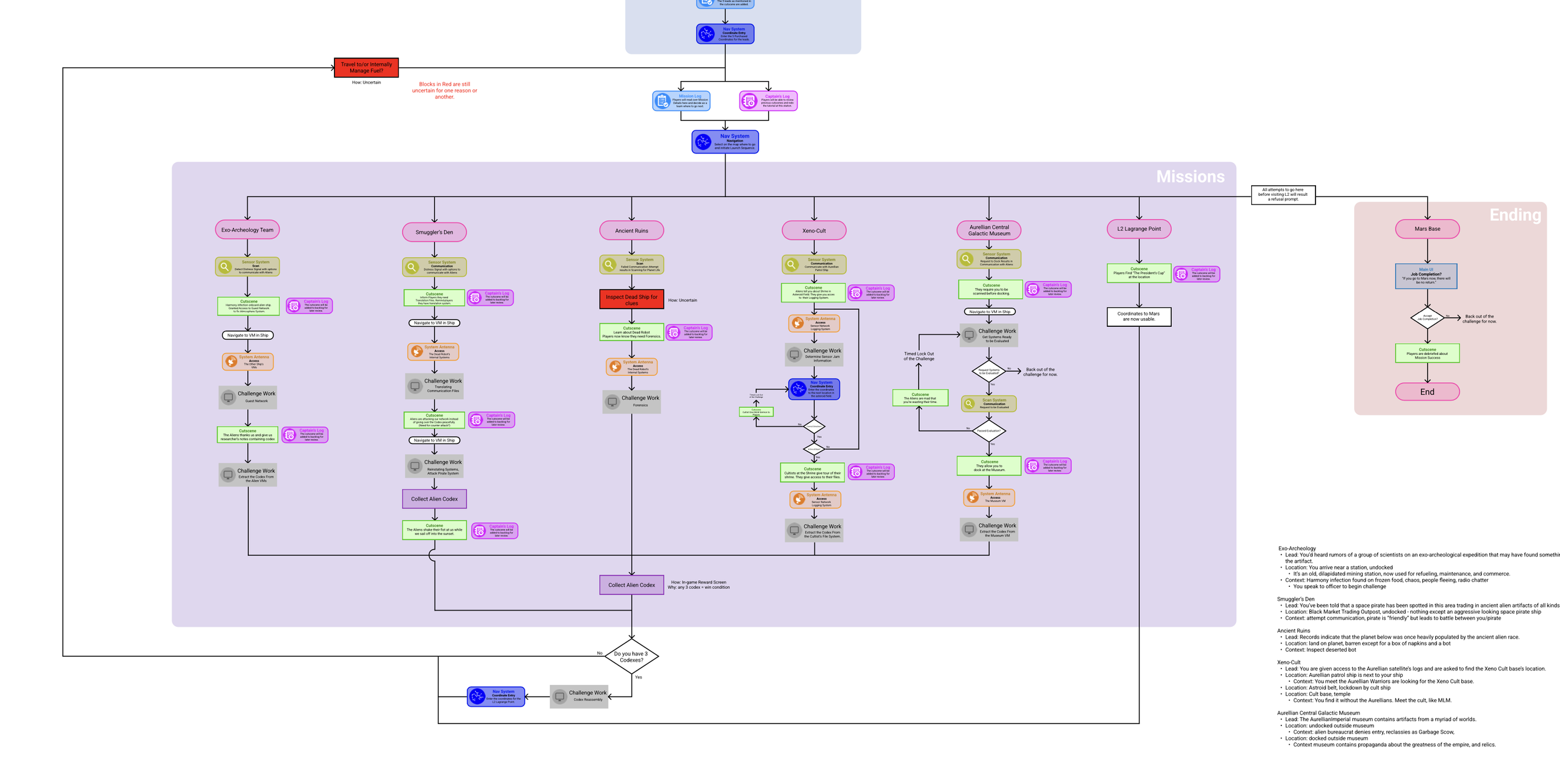
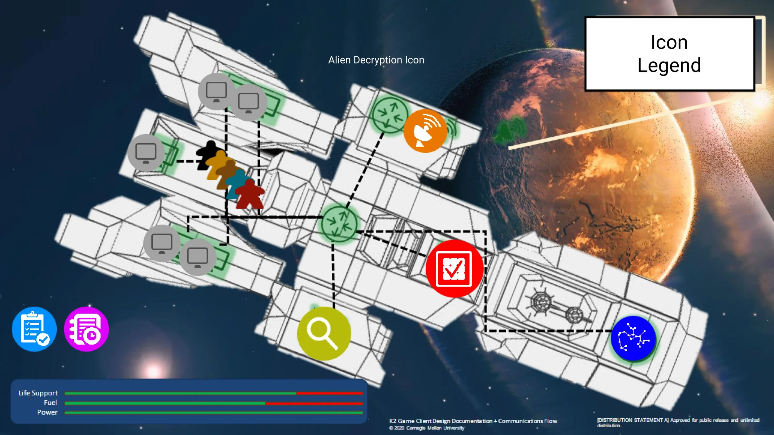
One of my primary contributions was co-creating the full UX flow document with another designer. This became the guiding document for the entire production team, a shared reference that mapped every state of the experience from login through intro, tutorial, missions, and ending.
The flow covered six mission locations: Exo-Archeology Team, Smuggler's Den, Ancient Ruins, Xeno-Cult, Aurellian Central Galactic Museum, and L7 Lagrange Point. Each mission had its own narrative context, lead information, and challenge work nodes where the black box cybersecurity challenges lived. The collect alien codex mechanic served as the win condition, tying the narrative and the competition together.
Launch Sequence
Launch Sequnce
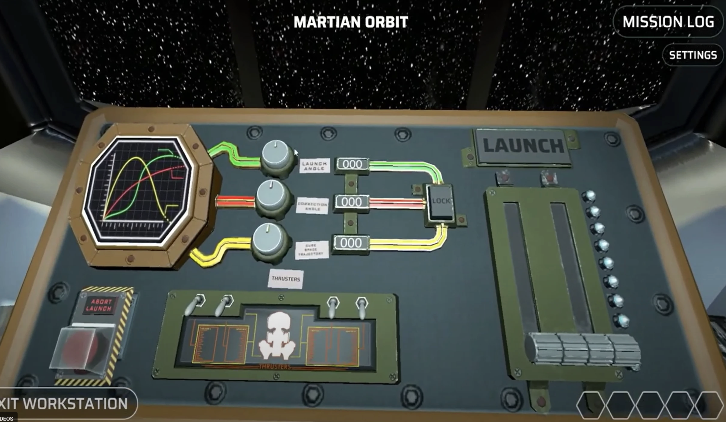
One of the most complex design problems was the launch sequence, the multiplayer coordination challenge that teams had to complete before navigating to each mission location. The sequence could be completed by one person alone or by the full five-person team working together simultaneously, with each crew member managing a different workstation: power routing, navigation, flight engineering, the cube drive, and running.
This design decision was driven by a real constraint: we didn't know exactly how many people would show up on each team. The launch sequence had to work for any combination of participants, while still rewarding teams who coordinated well with a faster launch time.
Early playtests were humbling. Teams failed repeatedly. People got stuck at workstations. Communication broke down. Instructions that seemed clear to us were completely opaque to players.
I ran multiple rounds of playtesting and iterated based on what I observed. Key changes included clarifying workstation icons, improving mission log instructions, color coordinating trajectories, and redesigning the information hierarchy so the right person always knew what they needed to do next.
HUD and Mission Log
I wireframed and prototyped the heads up display and mission log, the two primary interfaces players used throughout the game.
The design challenge for the HUD was balancing information density with visual clarity. Players needed to know where they were, what they needed to do next, and what their teammates were doing, all at a glance, in a high-pressure competition environment. The mission log layered information progressively, surfacing additional guidance for players who needed it while keeping the interface clean for those who didn't.
The mission log also served as the narrative delivery system. It was where leads appeared, where players tracked their progress across missions, and where the story unfolded between challenge sessions. Getting the hierarchy right inside the mission log was one of the things I spent the most time on. There was a lot of information that needed to live there, and the order in which players encountered it mattered enormously.
Iterative Playtesting
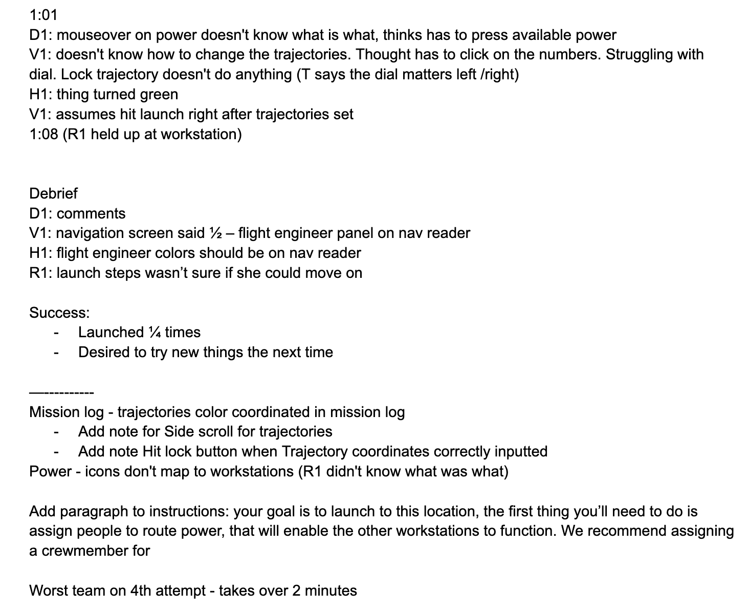
I ran multiple rounds of playtests throughout the summer, observing real teams navigate the experience and documenting every point of confusion, failure, and delight.
The playtests revealed consistent patterns. Players didn't know what the workstation icons meant. The launch sequence was too linear and left some players with nothing to do. The mission log wasn't being opened at the right moments. Each round of feedback drove specific design changes, which were tested again in the next round.
This process taught me how to design for 100% throughput. Every player on a five-person team needed something meaningful to do at every moment of the experience, even when the content inside the workstations was outside my control. That was the design problem I kept coming back to: not what is inside the box, but what does it feel like to be standing outside it?
Outcome
The game shipped and ran successfully at the 2022 President's Cup competition, where 240 five-person teams competed. The UX flow document became the production team's shared reference throughout development, and the launch sequence was used repeatedly throughout the multi-hour competition.
Reflection
President's Cup taught me what it means to design with constraints you cannot change. The black boxes were non-negotiable. I could not redesign the cybersecurity challenges. I could only design around them. That constraint forced me to think carefully about what design could actually control: the narrative, the information architecture, the coordination mechanics, and the moment-to-moment feel of moving through the experience as a team.
What I kept coming back to is that good design is often about making invisible structure visible, giving people a clear mental model of where they are, what they need to do, and why it matters, even when the content inside the structure is out of your hands. I think about that a lot when I approach new design problems. Not just what am I building, but what does it feel like to be the person navigating it.